I started thinking about how Britain is just really good at iconic marketing. Quietly posh, elegant, regal iconic marketing. Yes, the monarchy, the Mall, images of Buckingham Palace, Big Ben (which Anna and Michael will tell you is actually Elizabeth Tower and Big Ben refers to the bells as we learned on our bus tour), Tower Bridge, Westminster Abbey, are sort of a given.
The color red is very dominant here. There is definitely a British red. It is not shouty but it is bright. The red phone boxes, the red letter boxes, the red postal vans, one can't help but want to photograph them and stick them on a wall. All are the same rich tone of red, very identifiable, stable and consistent--like British culture. Paired with the red on the Union Jack and English flags, you get a lovely coordinated set of colors.
When my friend Jen and I and our kids went to the London Transport Museum in October, I was impressed by the level of thought put into iconographic transportation. Most people can picture the black London taxi and the red double decker bus. Even the London Underground, which itself looks like a standard subway train, was strategically given an iconic, very visible round red logo with a solid blue stripe joining each end. The Underground and buses allowed people to move to the suburbs and commute into the city for work. It was advertised that in the suburb, there was more space for a family, more greenery and fresh air and that transportation was heroic in affording this new opportunity.
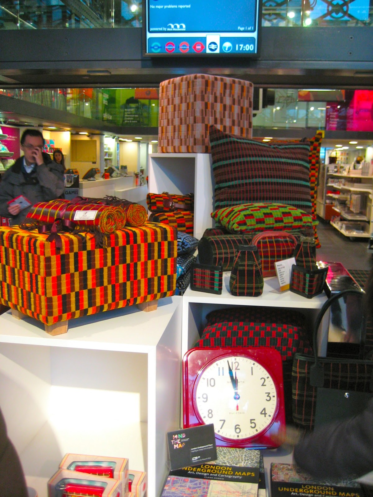 |
| "Underground" inspired furniture |
I haven't even yet mentioned Andy Warhol, the Beatles, most pop music of the 80's... Britain even "owns" the concept of a teapot and fine china. And biscuits. At least Americans have donuts and Coke.
